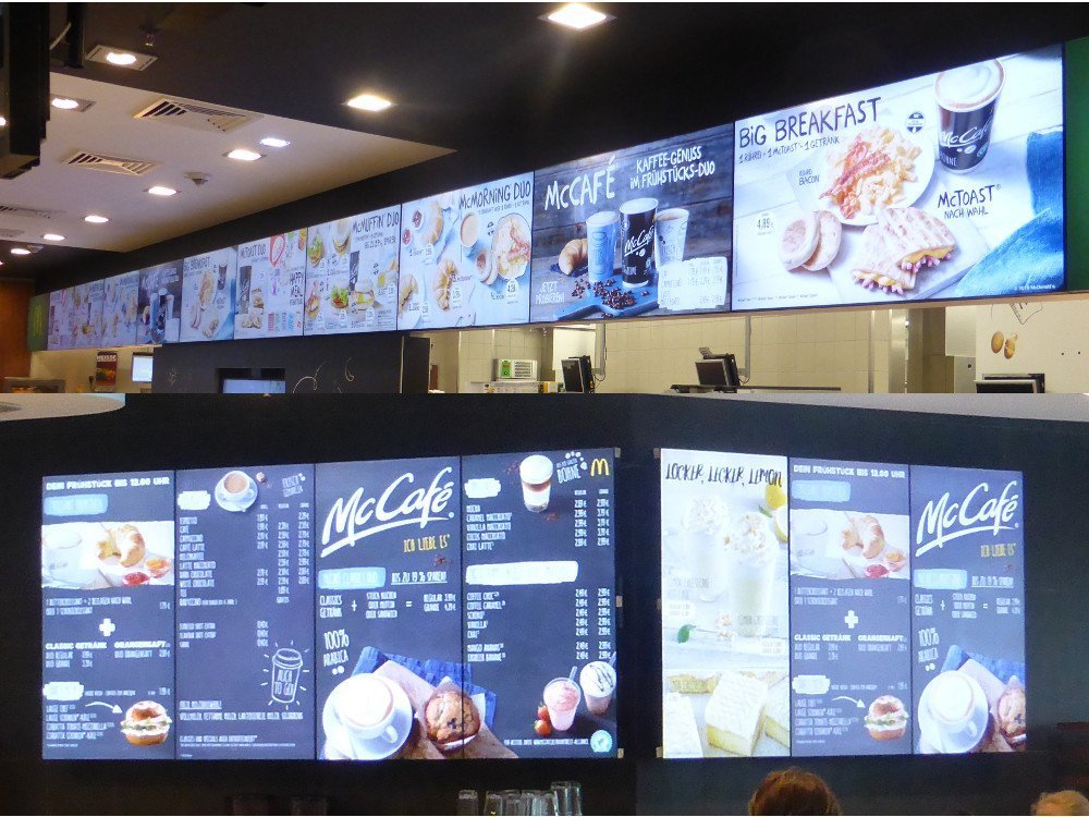
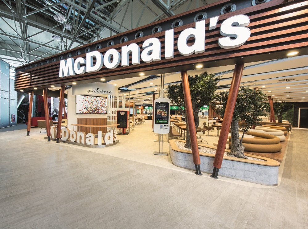
Now Mc Donald’s opened its newest restaurant at Frankfurt Airport Terminal 2. To be precise two separate restaurant opened on 30 March 2015 in front of the visitor’s terrace overlooking the runways. The German subsidiary focused on customer experience and improving processes. Mc Café and the restaurant feature separate concepts – barista take orders at the counter of Mc Cafe while self-order terminal dominate the restaurant.
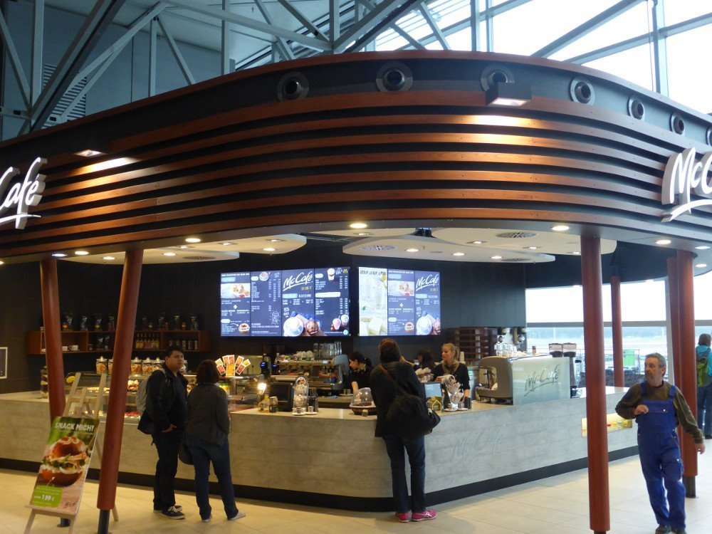
At the Café customers are lining up to order with the barista, seven NEC menu boards are installed in portrait mode. The core menu spreads over three displays whereas the four other media wall screens display time sensitive promotions. Screen design theme is similar to traditional signage with white lettering on black background. Images are lightly animated to bring some life to the menu board and to prevent sticking effects. To our knowledge Frankfurt Airport is the first Mc Café with digital menu boards in Germany.
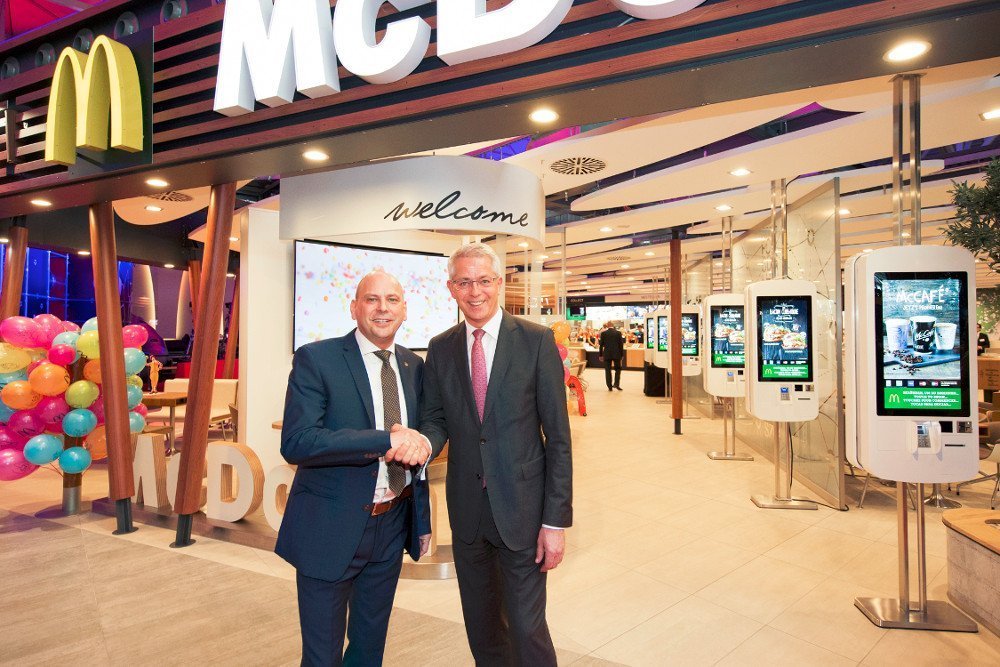
The main restaurant offers six double sided order terminals located along the main aisle towards the main counter. Three additional easy order terminals are distributed throughout the restaurant. All feature multi-language support (German, English, French and Spanish) and accept major credit and debit cards only. Guests who feel not comfortable operating the easy order terminals are approached by Mc Donald’s staff with mobile tablets. Orders are taken by staff via the tablet. The restaurant chain aims to completely separate the order and the pick-up process. Therefore the order terminals are complemented by a staffed welcome desk and flying sales agent.
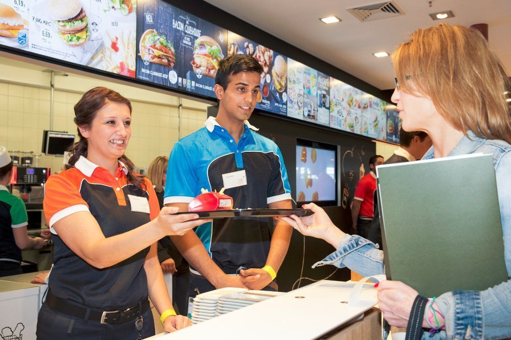
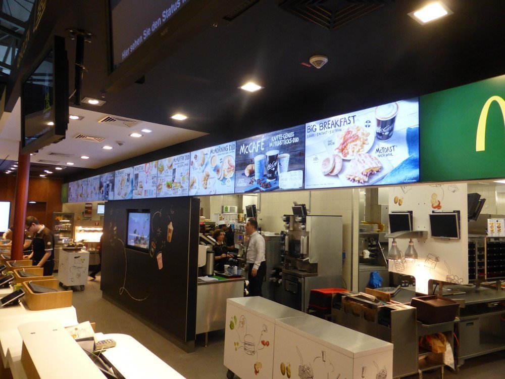
The pick-up zone is missing the long row of ePos terminals and lines of guests waiting to order their meals. The area is now dominated by seating benches in front of the long row of menu boards. The displays feature image rich content across 14 landscape oriented displays. The full menu listing is now only available on two portrait oriented displays on each side of the pick-up counter.
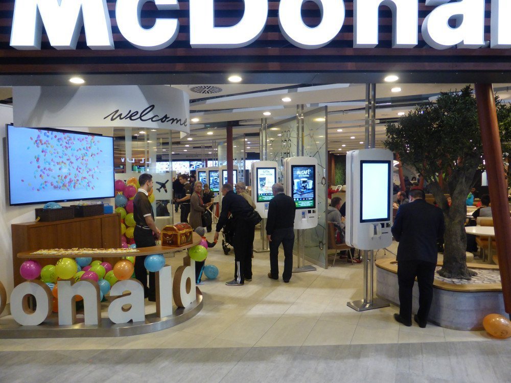
The main challenge will be what to show on the screens as guest finished already the order process before moving in front of the large menu board. As dwell time can be a few minutes Mc Donald’s will need to adapt content on the screens to entertain (or distract) customers. Currently guest mainly focus on the separate 32” queue management (or customer flow) screens.
To be fair the restaurant just opened and processes and content will be constantly adapted to the practical experience of daily business. The new digital concept at Mc Café as well as the restaurant are definitely an impressive improvement in customer experience. Even table service is being considered at selected restaurants.
In regards of the digital signage concept we would suggest moving some of the menu signage towards the entrance closer to the order zone. While the impressive menu board media wall at the counter could be used more for entertaining as well as integrating the queuing system for a more prominent display of the waiting numbers.
For more details and photos read also the invidis site inspection report at invidis.de

