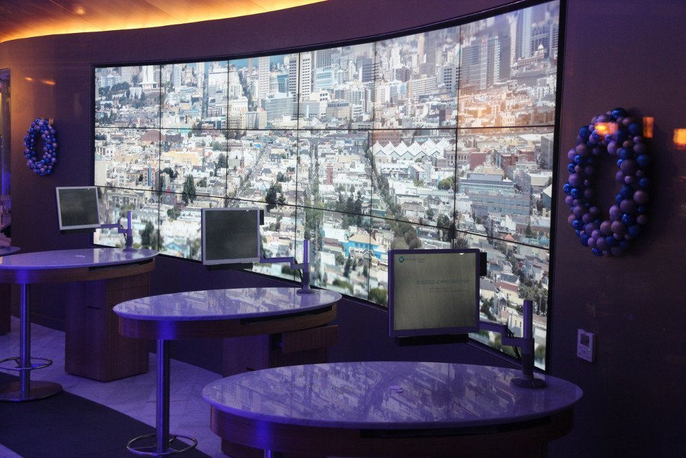
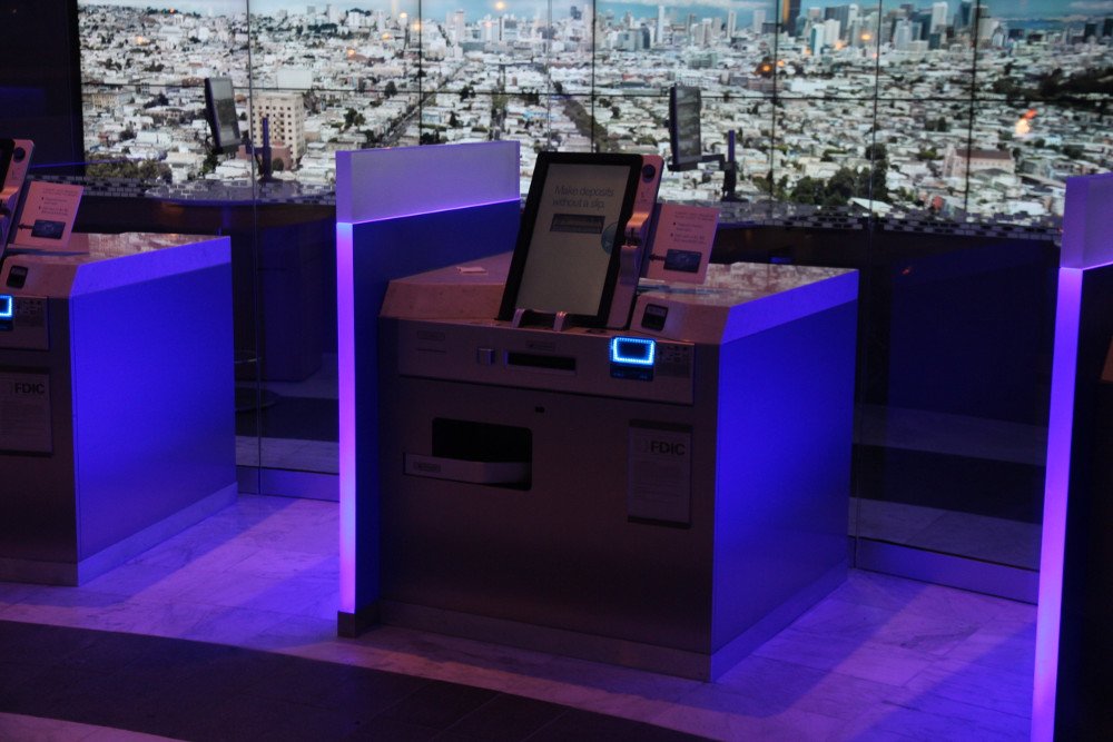
Chase operates more than 5.500 branches and almost 20.000 ATMs in the US alone. The Union Square branch incorporates different new design and technology modules. Most striking is the lobby with a 18 display video wall and the new self-service terminals with 21,5″ displays (10:16 aspect ratio).
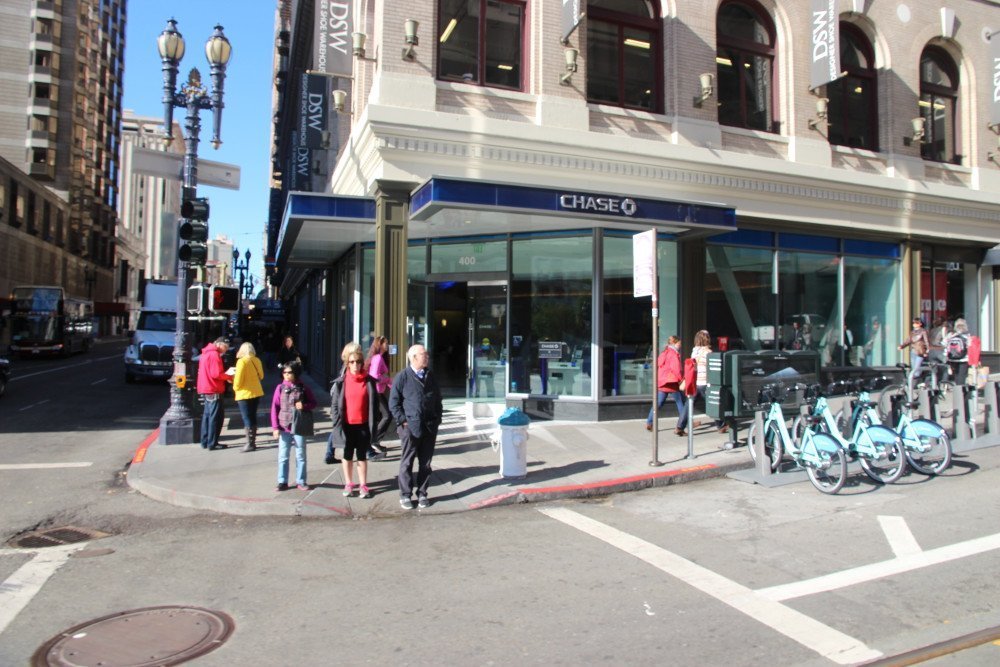
- Chase flagship branch at Union Square – the video wall doesn’t attract passersby during daylight, but at night …
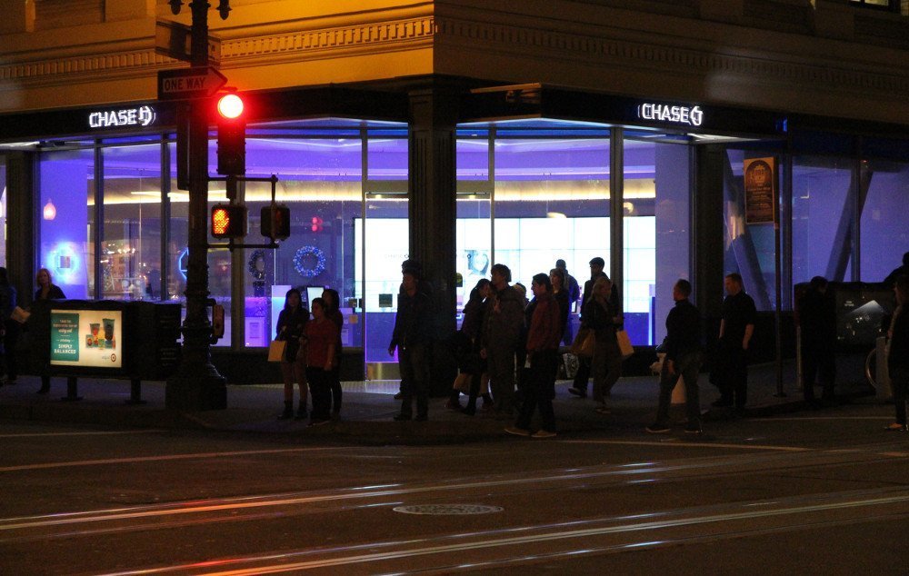
- … Video Wall (6×3) and distinctive blue LED lighting at nighttime
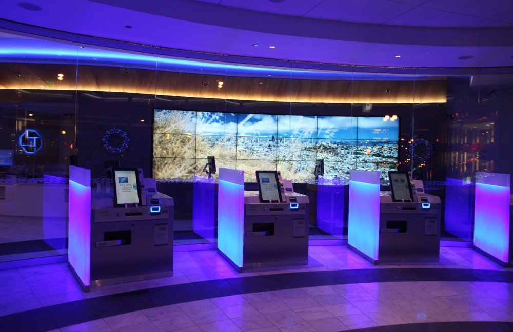
- Self-Service terminals with 21.5″ touch screen offer iPad similar user experience and personalized user interface
- During office hours Chase associates can help customers at individual desks located behind the self-service terminals
- Chase lobby and video wall
- Self-Service Terminal – Chase Bank Flagship Store am Union Square in San Francisco
Chase aims to get banking customers back into the branch by offering joy of use with familiar digital devices. The self-service terminals offer an iPad like user experience, the interface is customized for each customer (i.e. account balances, buttons with preferred cash withdraw amounts and USD bill denominations are preconfigured) and personal assistance is Omni-present.
The video wall transports a local image to the global JP Morgan Chase brand and draws attention to passersby especially at night. Various other zones i.e. classic bank teller as well private meeting rooms are also available.
Invidis comment
The video wall and LED lighting is very impressive – interactivity is focused to the self-service machines. We do like the concept and it is designed to be rolled out in prime locations across the nation. Compared to the Umpqua Bank flagship store the Chase branch feels much more like a conventional bank. This doesn’t have to be a drawback – it is just a different approach and without a doubt more scalable.
asf
The flagship branch was designed by San Francisco based architects Gensler – the biggest architecture firm in the US. The architects have published an interesting report about the design concept

